Branding · Case study
TOGL Rebranding
Tourism Organization of Loznica (TOGL) – Loznica, Serbia
- Client
- Tourism Organization of Loznica (TOGL)
- Scope of project
- Strategy, Creative direction, Brand identity, Illustration, Advertising, Product design
- Location
- Loznica, Serbia
- Designer
- Ivana Aničić
Overview
A strategic rebrand of the Tourism Organization of Loznica – from the logo and style guides to illustrated maps, publications and award-winning souvenirs.
- Long-term partnership with a public institution
- Recognised a dozen times in competitions for publications, souvenirs and illustrated maps
- Logo built from four pictograms of the city's main attractions
The challenge
The Tourism Organization of Loznica (TOGL) is a public institution and a local leader in innovative initiatives. The goal was to increase the number of visits by branding the region's tourist sites, raise the popularity of the brand and affirm the tourism potential of the city. That meant clarifying the brand's positioning and the visitors it serves, and creating a visual identity for every touchpoint – from badges to social media and everything in between.
Research and strategy
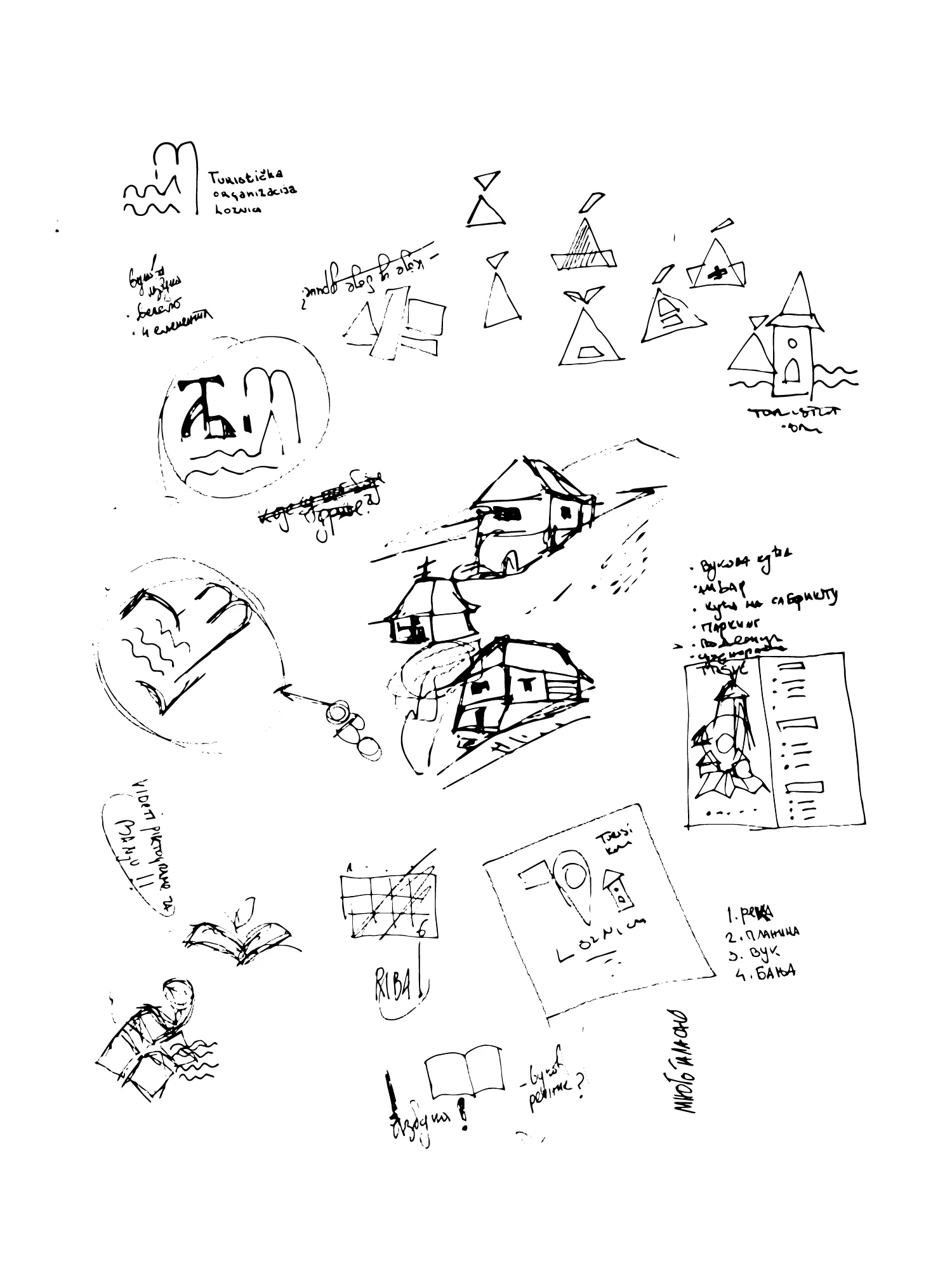
Making something unique starts with research: identifying the problem, the goal, the values and the key words. Rebranding a city is a complex task, so the work was divided into phases. The first phase discovered the unique values the city has to offer and translated them into the visual language of the brand guidelines.
Together with the TOGL director, Ivana created a positioning plan based on brand benefits and competitive advantages. A competitive audit of the strengths and weaknesses in the brand's landscape guided the decisions about future positioning.

The logo
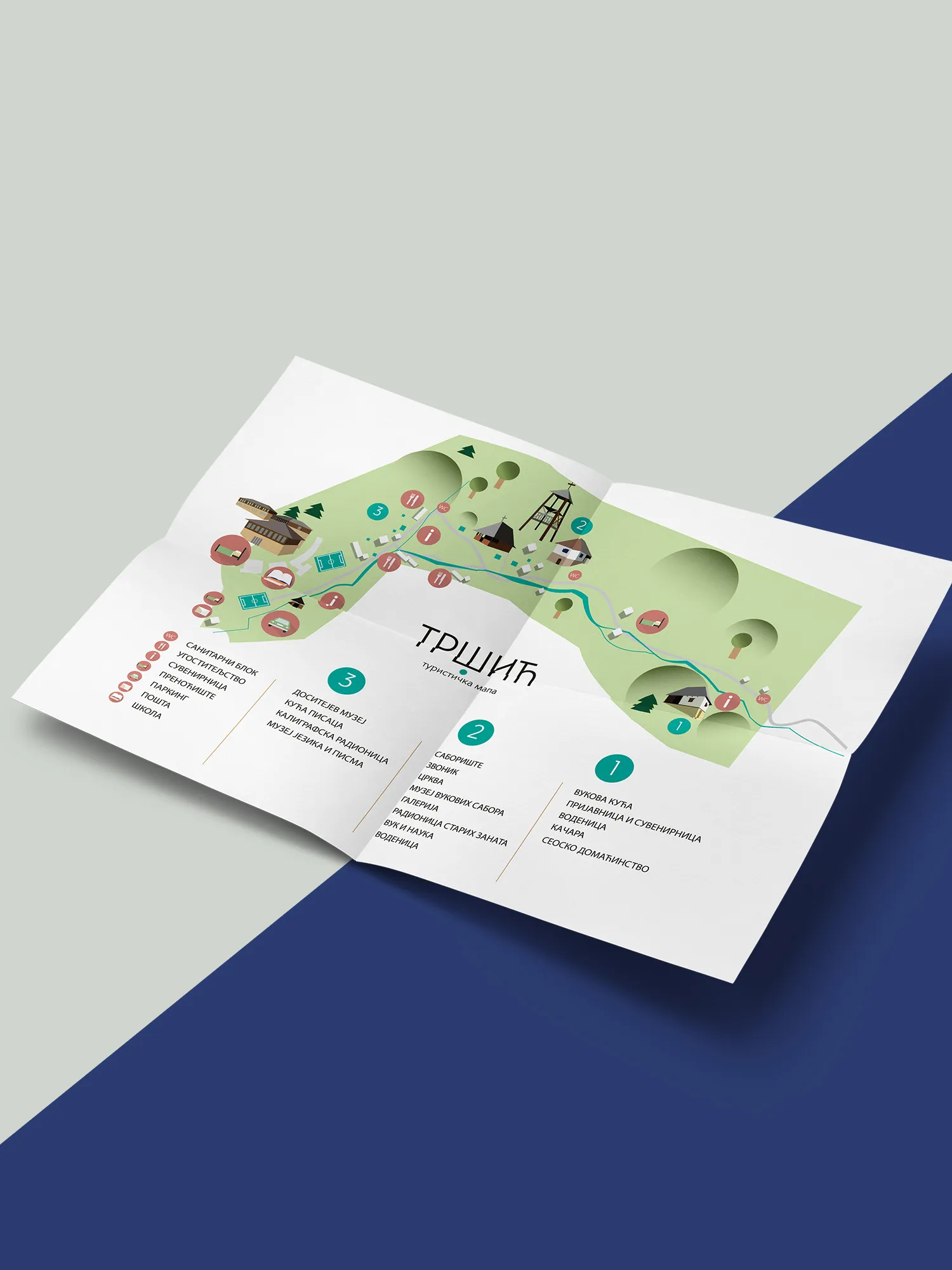
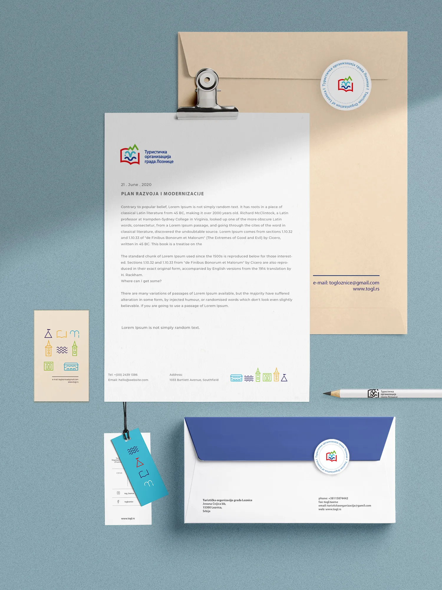
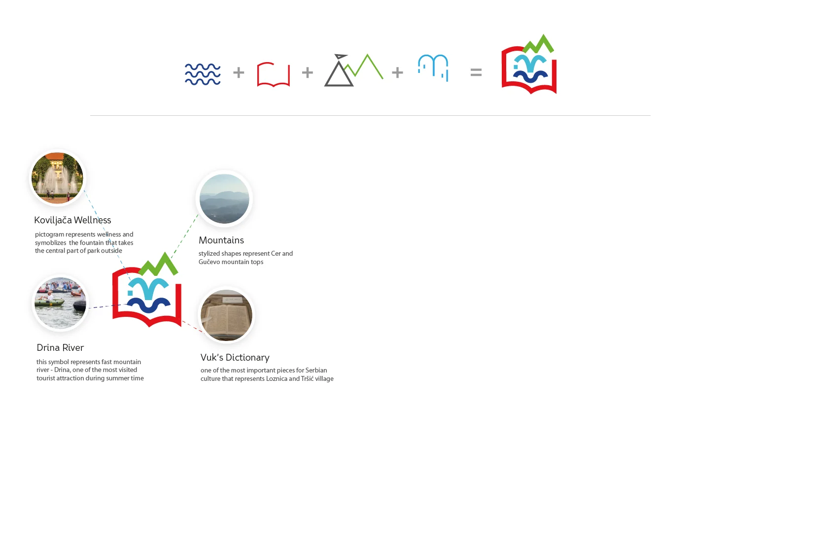
The logo is made of four pictograms – the same stylised icons used in the tour guides to mark sights on the map. Together they represent the four main attractions of Loznica: Koviljača wellness, the village of Tršić, Gučevo mountain and the Drina river. Bright colours express the vivid variety of the city.
The outcome
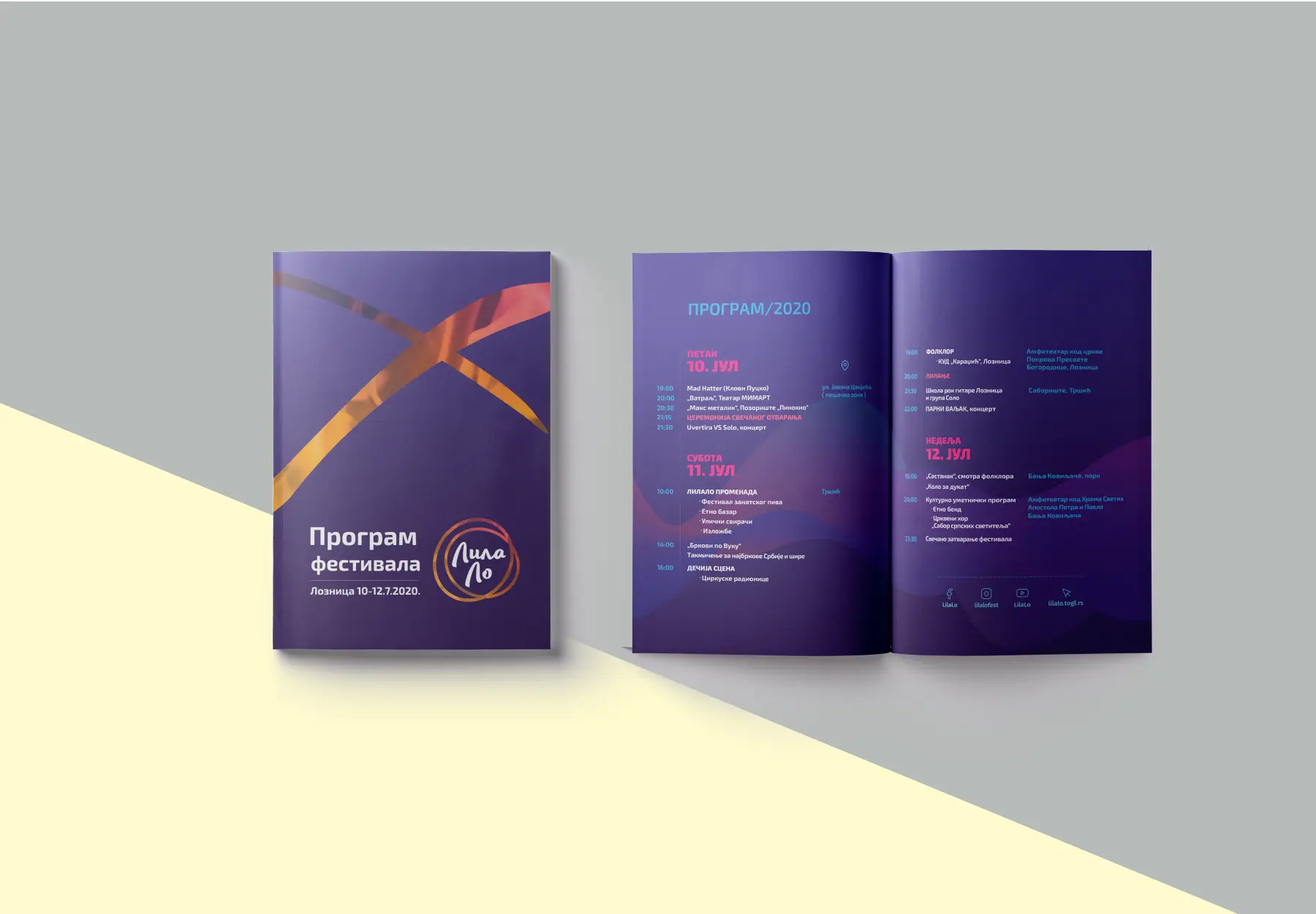
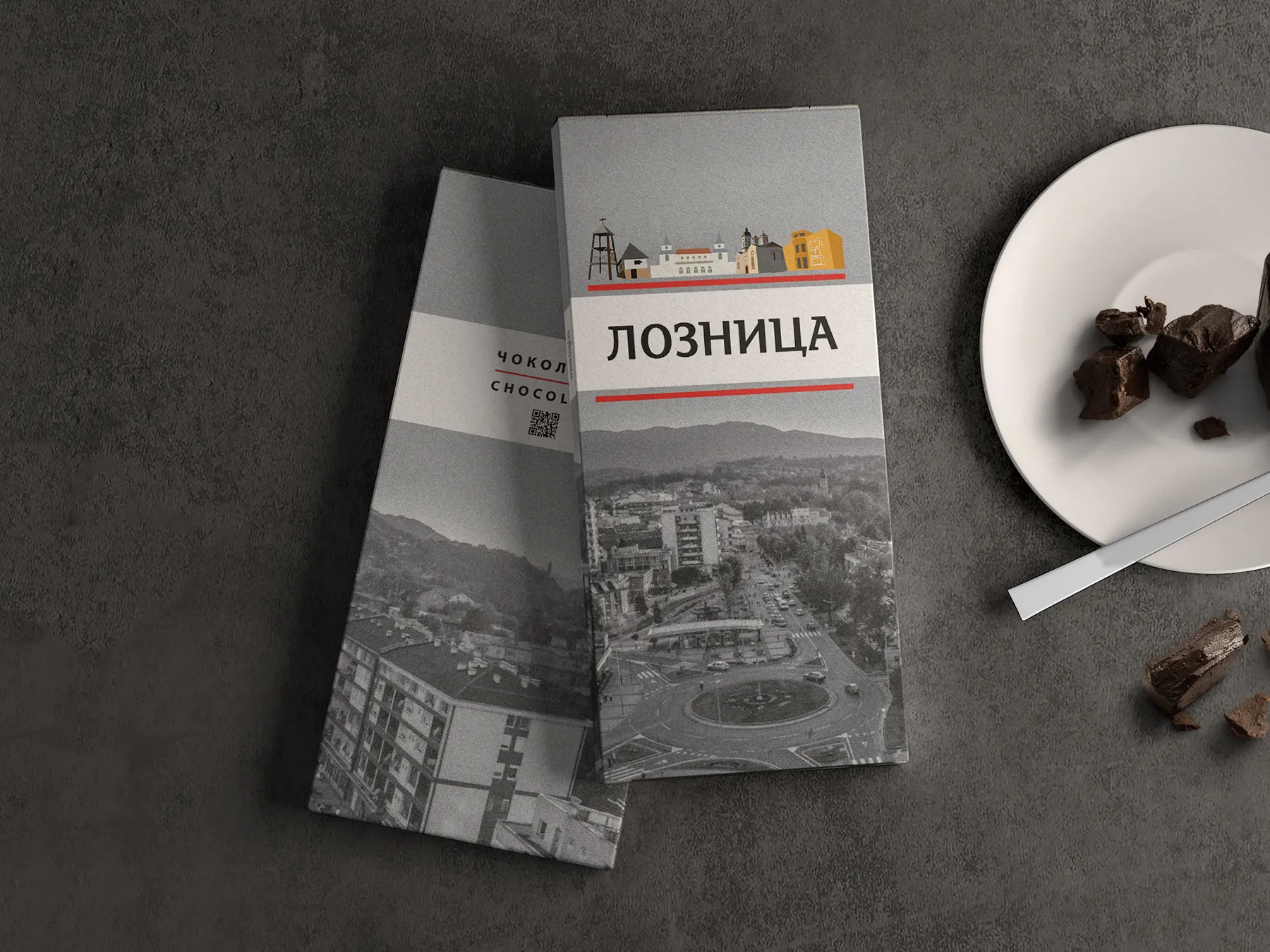
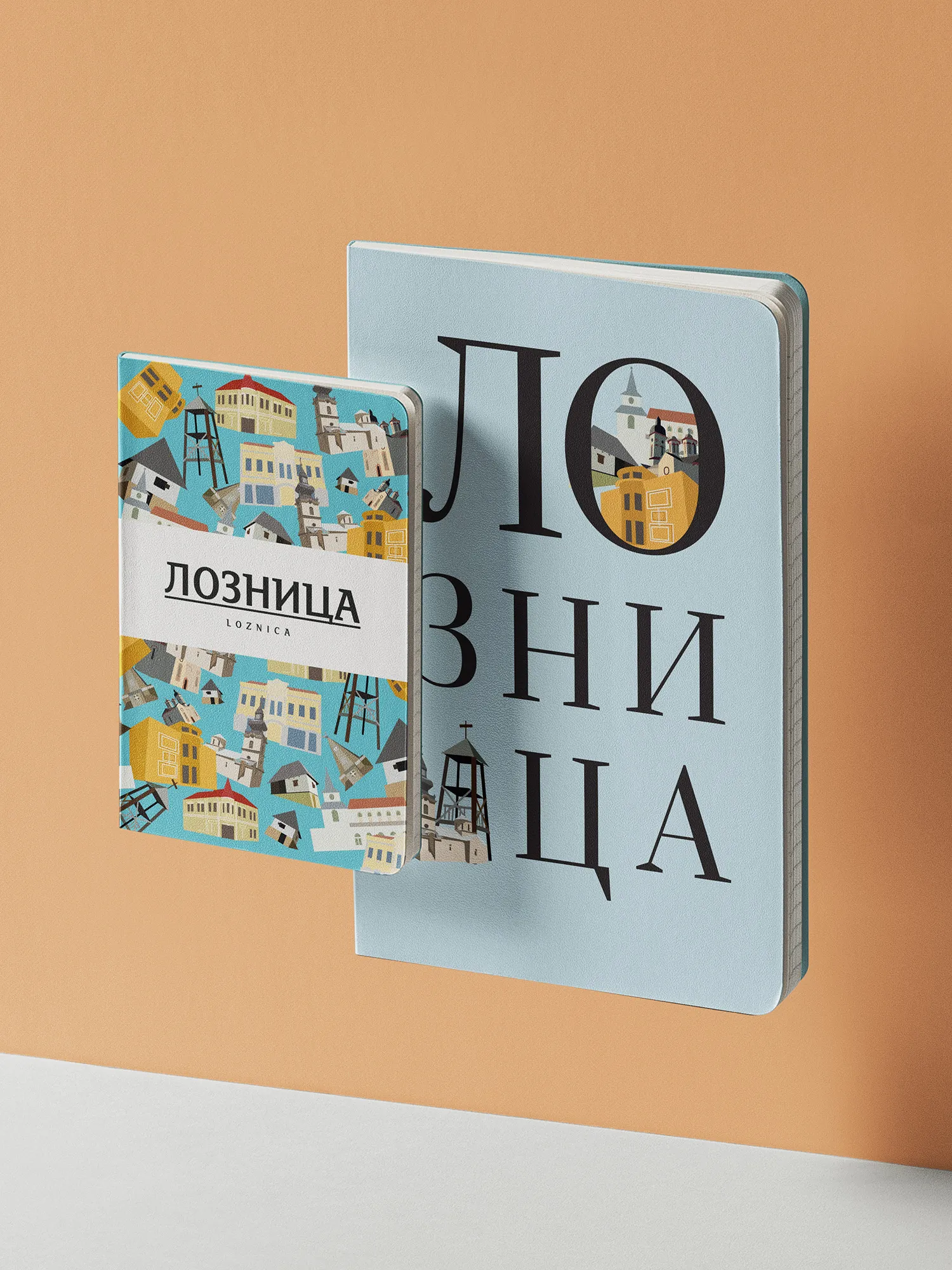
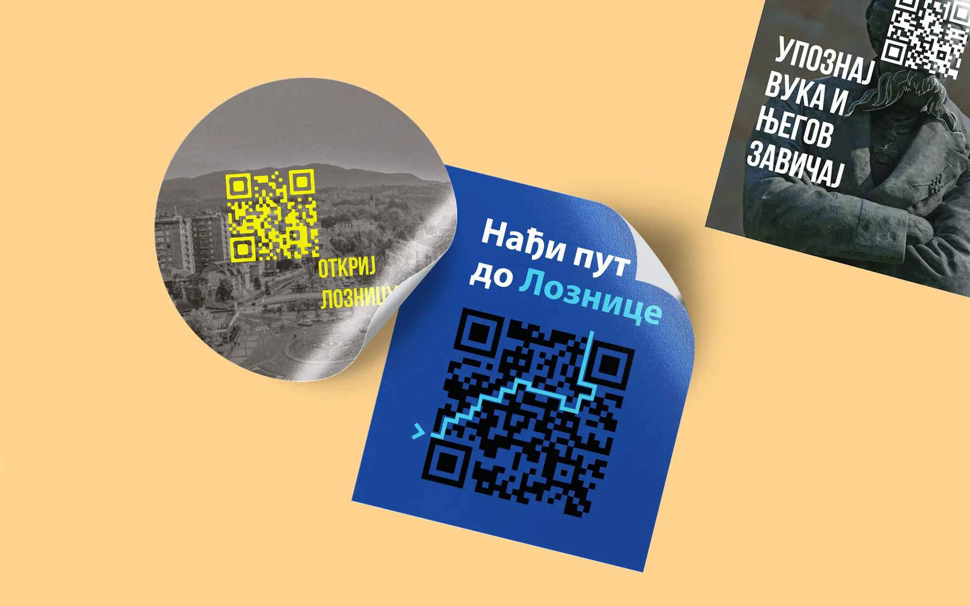
A complete strategic rebrand: logo, style guides, a custom icon and illustration set, signage, brochures and publications, souvenirs, social media filters and communication, and illustrated maps. What started as one ambitious project grew into a long-term collaboration – and TOGL has since been recognised a dozen times in competitions for the best small publication, the best souvenir and the best illustrated map.



Planning something similar?
Start a project