Branding · Case study
LilaLo Festival
LilaLo music and performance festival – Serbia
- Client
- LilaLo music and performance festival
- Scope of project
- Strategy, Creative direction, Consulting, Brand identity, Concept design, Advertising, Product design
- Location
- Serbia
- Designer
- Ivana Aničić
Overview
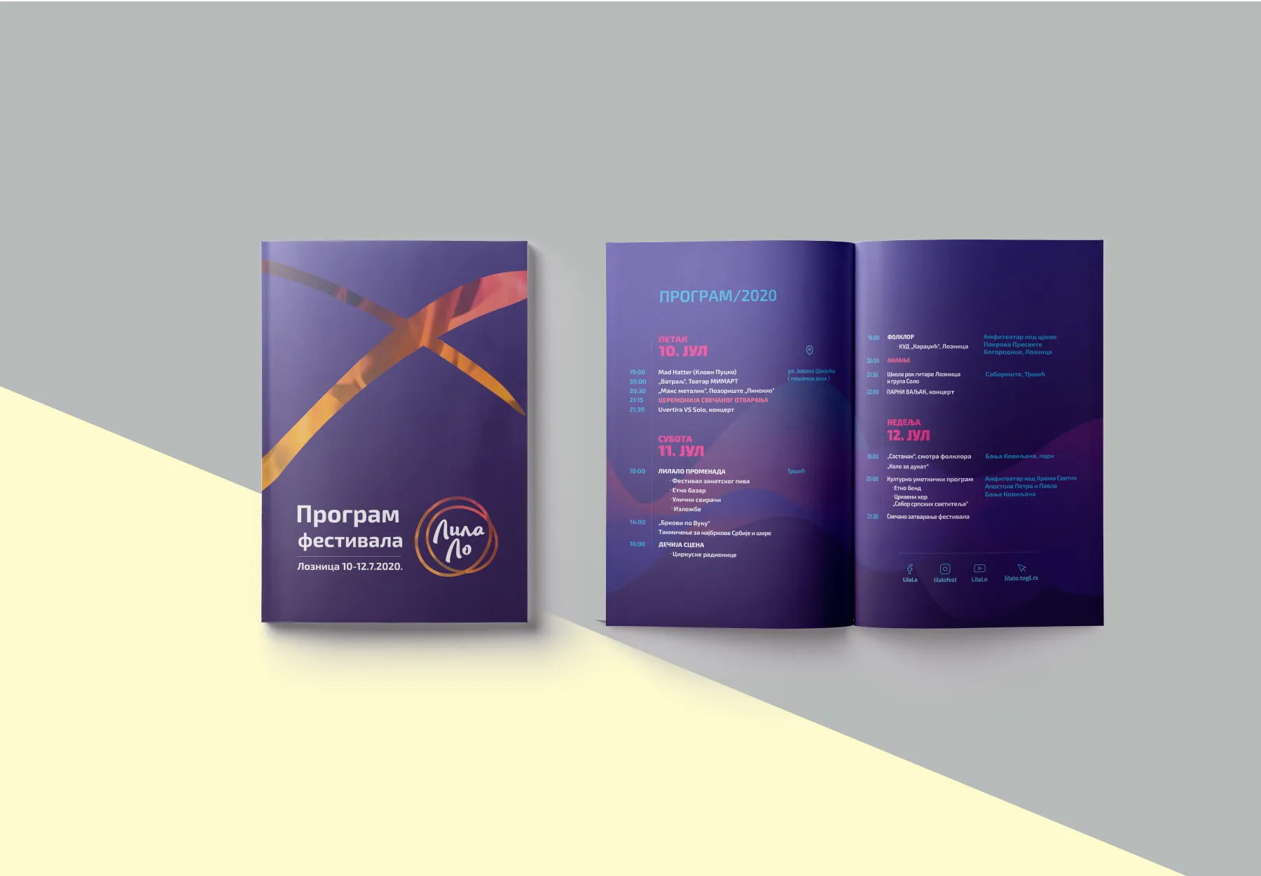
Visual identity for a youth music and performance festival inspired by lilanje, a Serbian folk tradition of night-time fire rituals.
Fire and rhythm. Light and movement. Youth and music.
LilaLo is a music and performance festival dedicated to the folk tradition known as lilanje, with the aim of affirming the creative potential of young people. The theme of the festival is the light of a lila – a burning bark – that illuminates the future and arouses optimism.


The concept
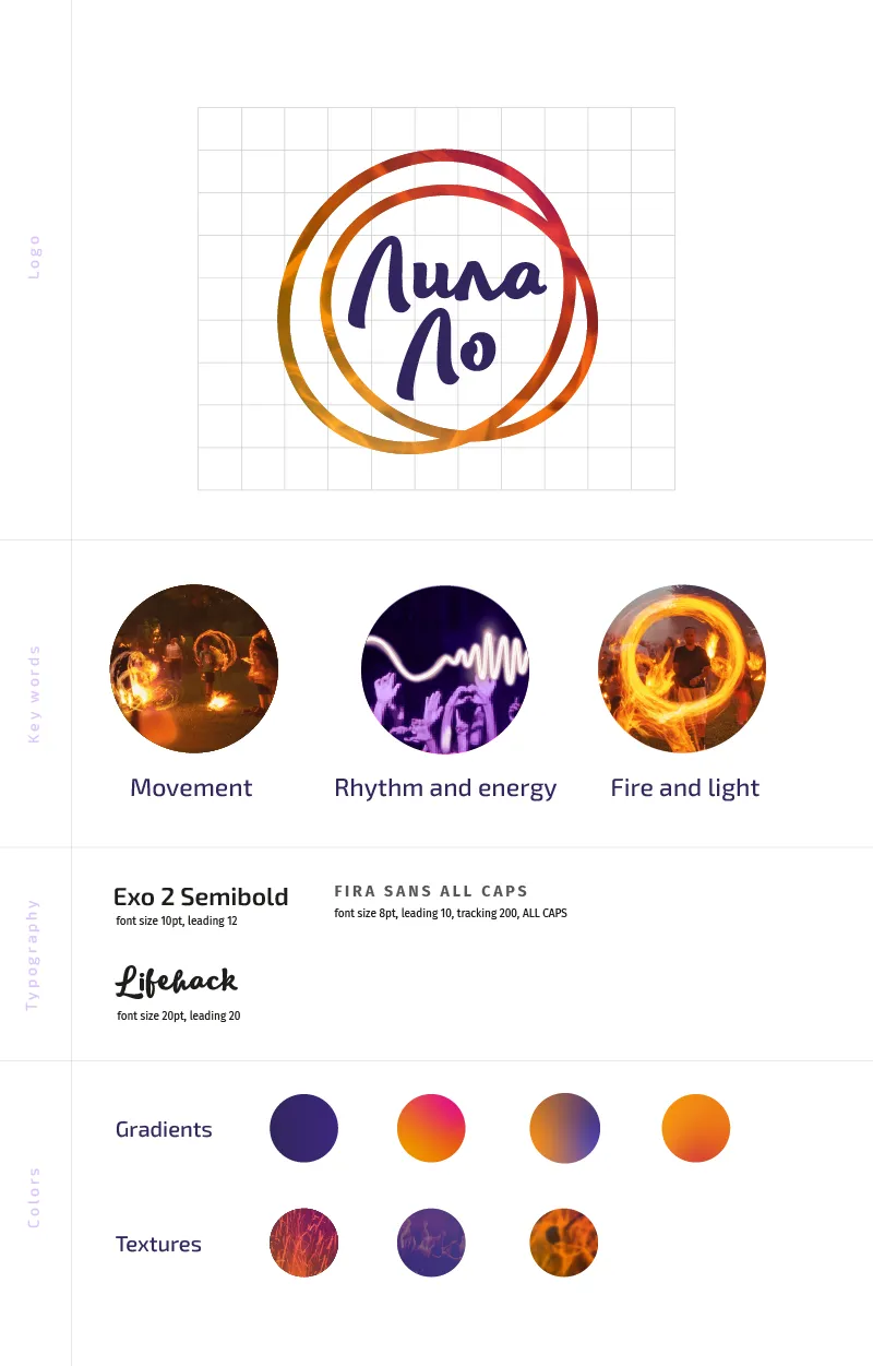
The lilanje tradition was the core inspiration for both the festival and its visual identity. By stylising the forms of fire flames, the identity portrays the energy and rhythm of the festival. The visual sensation of a light trace left by a burning bark in motion became the starting point for the logo.
The cult of fire
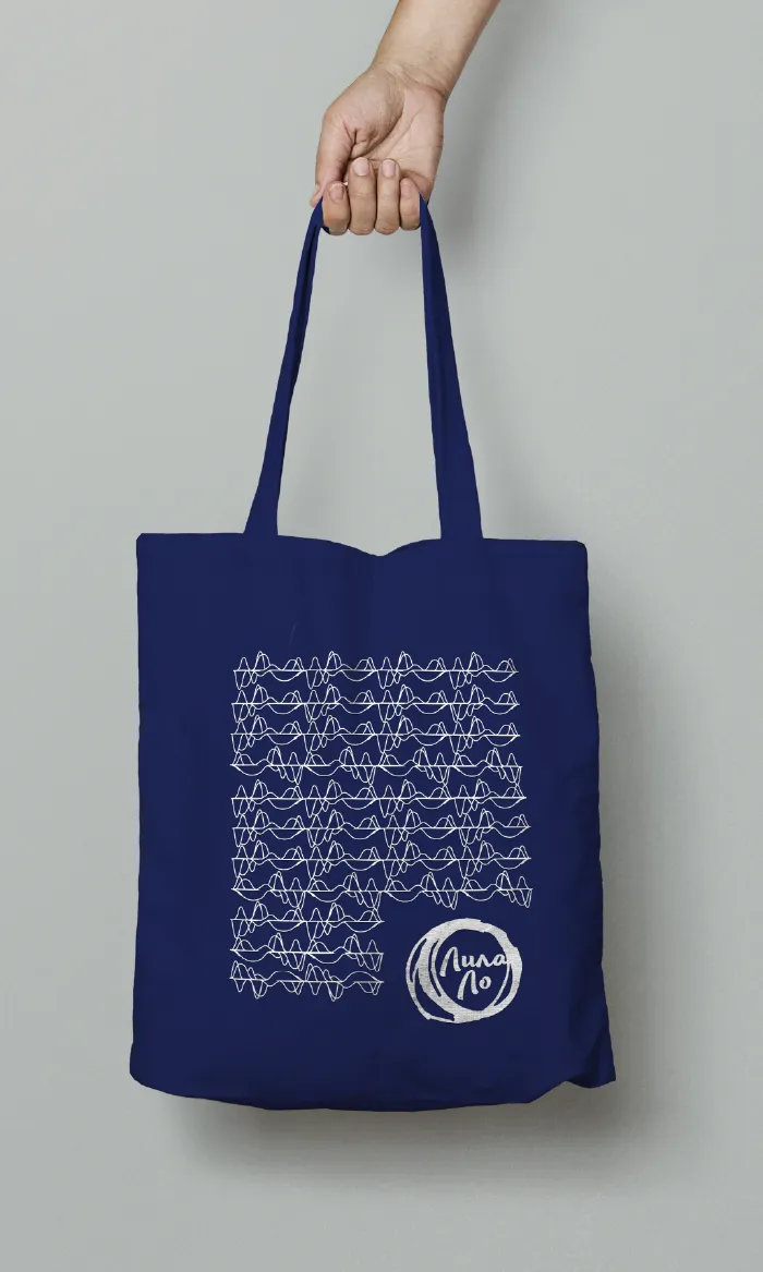
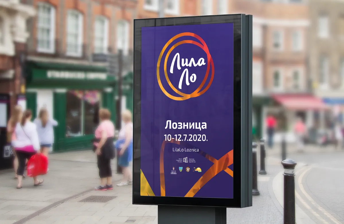
Designed to evoke positive emotions, the logo is an association of fire and freedom, and the identity is built on abstract forms that represent light traces in the night. The simple but dynamic logo can transform through patterns, textures and gradients. The colour palette pairs purple, an impression of the night, with warm orange for the flames.


Planning something similar?
Start a project